The short answer? Yes. And no. But mostly yes.
Setting aside philosophical questions about qualia (whether your "red" feels like my "red"), there's something objectively weird about human colour perception that most people never notice:
Cyan and blue are separated by roughly 20 nanometers in wavelength, and most people struggle to name the difference between them.
Amber and orange are separated by about 10 nanometers, half the distance, and everyone immediately recognizes they're distinct colours.
Why would half the wavelength distance produce more perceptual difference? Shouldn't perception scale linearly with physics?
Why Do We Have So Many Words for Warm Colours?
Count the colour terms you know between red and green:
Crimson, scarlet, vermillion, burgundy, maroon, cherry, rose, pink, coral, salmon, peach, rust, copper, bronze, orange, tangerine, apricot, amber, gold, yellow, cream, ivory, chartreuse, lime, olive...
Now count between green and blue:
Teal, turquoise, cyan, aqua, cerulean, azure, sky, navy...
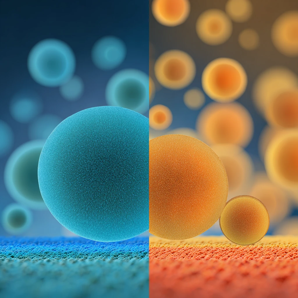
That's 25 specific terms for the warm range and 8 for the cool range. The warm terms are also precise: people know vermillion from scarlet, sage from mint. The blue terms are vaguer and harder to pin down.
The pattern shows up across languages. Berlin & Kay's 1969 survey of basic colour terms found that languages name red before green and yellow, and green and yellow before blue. Many languages use a single word for blue and green.
What's Happening in Your Eyes?
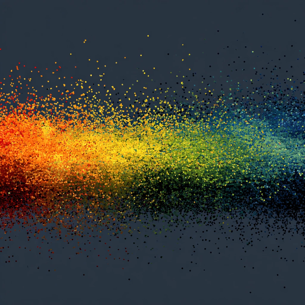
Your eyes have three cone types: L (long wavelength), M (medium), and S (short):
- L cones peak ~565nm (yellowish-green)
- M cones peak ~540nm (green)
- S cones peak ~445nm (blue)
Notice something? L and M are separated by just 25 nanometers. M and S are separated by 95 nanometers, almost four times wider.
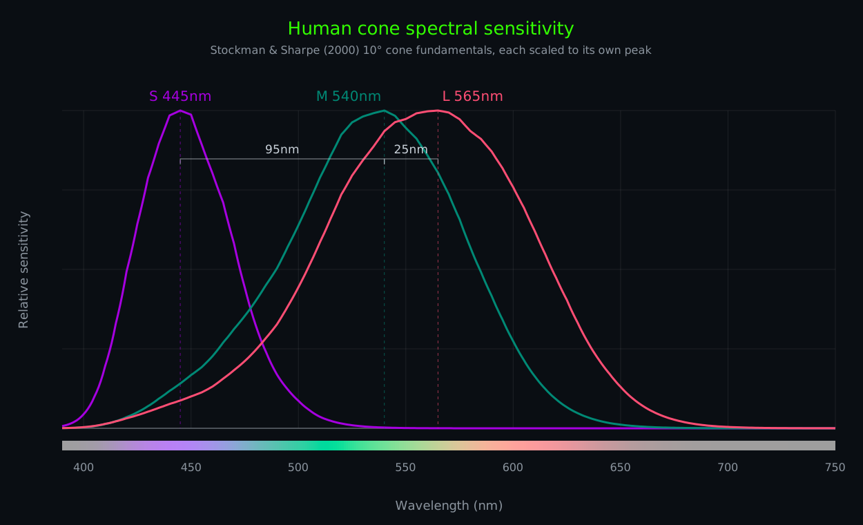
Peaks from the Stockman & Sharpe (2000) 10° cone fundamentals, in energy units. Other data sets and measurement methods shift these by a few nanometers; the spacing is what matters.
Here's what that looks like on a real scene. Same photo, split into what each cone type responds to, with no per-channel levelling, so a neutral grey reads the same in all three:




I dunno about you but it's hard for me to tell L and M apart. The red hair is a touch brighter to L; nearly everything else matches within a few levels. Every warm colour you can think of comes from that teeny difference. S differs the most: hair and foliage go dark, the white shirt stays bright, but S adds almost nothing to how bright things look to us.
Your colour perception isn't about absolute wavelengths. It's about the ratio between cone responses, and the cones are wired into two separate comparisons: red-green compares L against M, and blue-yellow compares S against L and M combined. The genes for the L and M pigments sit side by side on the X chromosome, which is why red-green colourblindness is far more common in males, who have only one X. The S pigment gene is on chromosome 7, and losing S cones (tritanopia) is rare, around 1 in 10,000 people or fewer. Red-green discrimination comes from the difference between two curves only 25nm apart.
The cone counts are uneven too. S cones make up only about 5 to 10% of your cones, so L and M outnumber them roughly ten to one. The centre of your fovea, the spot you're reading this with, has almost no S cones at all. Red-green information gets both the tighter spectral spacing and most of the photoreceptors.
More samples = more information = more distinctions = more words = richer phenomenology?
I'm not sure about you, but red, orange, amber, yellow, lime and green hold a more vivid place in my imagination than teal, cyan and blue do. What about you?
Where Colours Probably Are
If colour is ratios, then the colour names should be findable in the ratios. Take the three cone curves, scale each one so that white light (equal energy at every wavelength) gives the same response in all three, and form three comparisons:
- A (alpha) = L / (L + M). How much the long cone wins against the medium one. Redness.
- G (gamma) = M / (L + S). How much the medium cone wins against both of its neighbours. Greenness.
- B (beta) = S / (S + M). How much the short cone wins against the medium one. Blueness.
White scores 0.5 on all three, by construction. Any other light lands above or below that line, and a single wavelength swept across the spectrum traces a curve:
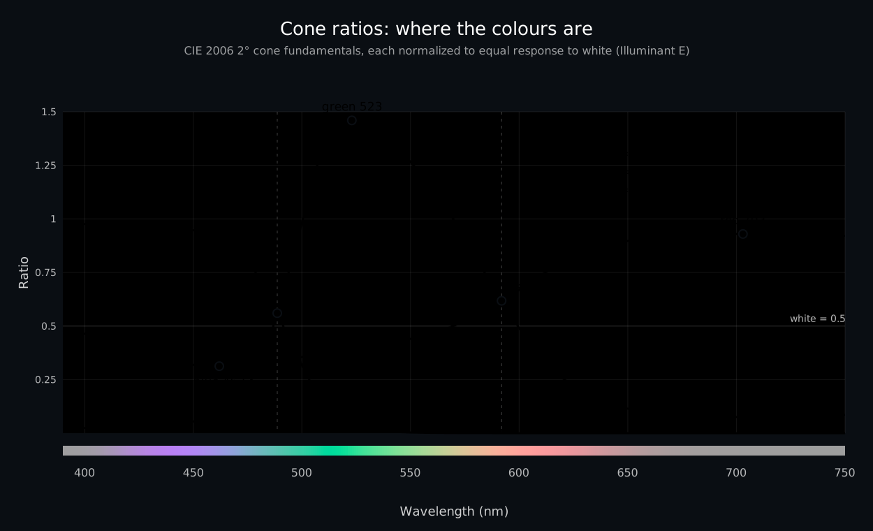
CIE 2006 2° cone fundamentals, each normalized to equal response to Illuminant E. White is 0.5 on every curve. The turning points give red, green and blue. Whichever ratio is largest names the region, and the handovers are cyan and yellow.
The primaries are where the curves turn around. Red is 703nm, the top of the A curve: the wavelength where L beats M by the widest margin. Beyond it both cones fade together and the ratio drifts back. Green is 523nm, the top of the G curve, where M stands out most against L and S together. Blue is 462nm, and it's the bottom of the A curve, not the top of the B curve: the point where L loses to M by the most. Blue isn't where the S cone peaks (that's around 445nm, and it looks violet). It's where the red-green comparison hits its floor.
Yellow and cyan aren't peaks. They're handovers. At any wavelength one of the three ratios is the largest, and that one names the colour. Below 489nm it's B. From 489 to 592 it's G. From 592 up it's A. Cyan is 489nm, where greenness overtakes blueness, and yellow is 592nm, where redness overtakes greenness. That makes the whole spectrum three colours with two boundaries: blue is anything shorter than 489, green is 489 to 592, red is everything longer. Every other name is a position inside one of those three.
None of those five numbers were chosen. They fall out of the cone curves, and the first three are the primaries of the colour model in VSF: red 703, green 523, blue 462, white at Illuminant E. Specifying primaries as wavelengths instead of chromaticity coordinates means they can be reproduced in any lab with a monochromator, and they stay put when a better observer model comes along. Swap in the 10° fundamentals from the chart above and green moves to 519, cyan to 484 and yellow to 588, while red and blue stay within a nanometre.
Look at the spacing, because it's the first question on this page in a different form. Blue to cyan is 27nm. Cyan to green is 34. Green to yellow is 69. Yellow to red is 111. The A curve crawls thru the blues and greens and climbs steeply thru the oranges: the 10nm step from 585 to 595 moves the red-green ratio more than twice as far as the 20nm step from 470 to 490 does. On the comparison with most of your cones behind it, amber and orange are further apart than cyan and blue.
What About Colourblindness?
The most common forms of colourblindness involve the L and M cones. In protanopia the L cones are missing; in deuteranopia the M cones are missing. In protanomaly and deuteranomaly, which are milder and more common, the cone is present but its peak sits closer to the other one. In every case the L/M difference that separates reds, oranges, yellows and greens shrinks or disappears.
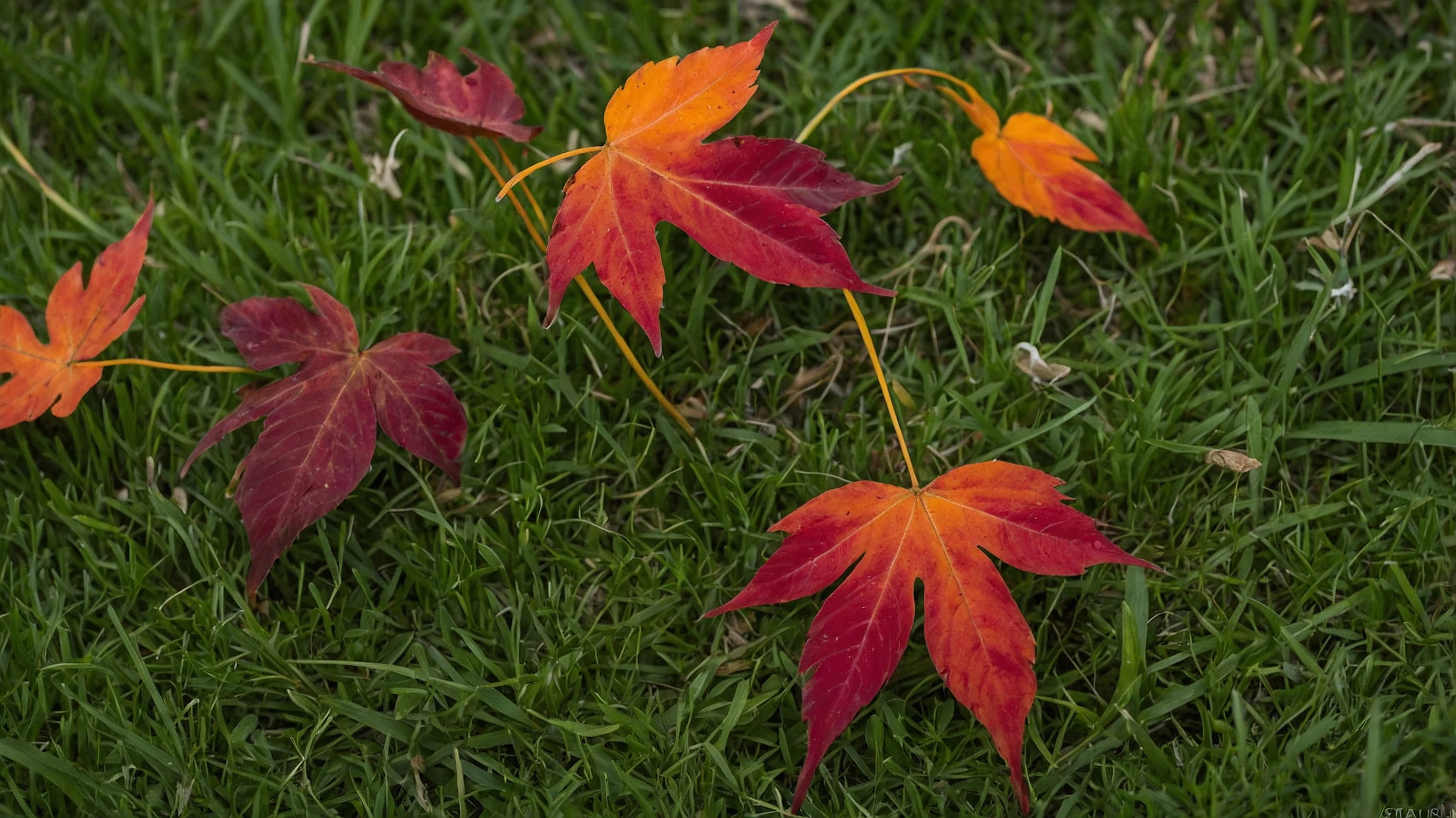
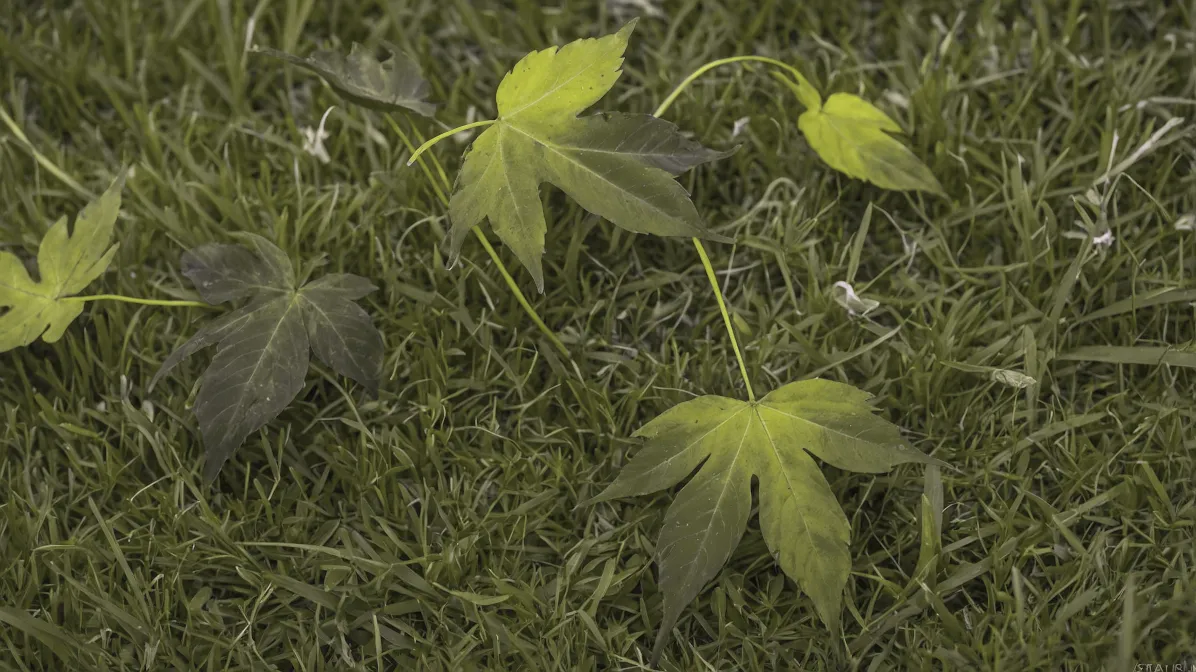


Drag the slider to compare normal vision with deuteranope (leaves)
and protanope (woman in red)
P.S. If you're dragging away and both sides look the same, you're probably a deuteranope or protanope yourself. Hi! In each pair below, one type of colourblindness sees the top and bottom as the same colour:
Screens vary, so treat this as a hint, not a diagnosis. An eye care professional can test properly.
A deuteranope has no M cones, so there is no 25nm L/M difference to compare. Their remaining L and S cones peak about 120nm apart. Ambers, corals, salmons and greens that differ only in their L/M balance look the same to them. They still see colour, along a single blue-yellow axis.
Conventional colourblind glasses use notch filters that block light where the L and M curves overlap most. That increases the difference between the L and M signals, which helps anomalous trichromats whose L and M peaks sit too close together. A dichromat has only one of the two cones, so there is no L/M difference for a filter to increase.
So Then, Do We All See the Same Colours?
YES! Assuming normal trichromatic vision.
Slight variations in cone sensitivity (you might peak at 565nm where I peak at 563nm) don't matter much because colour perception is ratiometric. The math is the same. The phenomenology follows from the math.
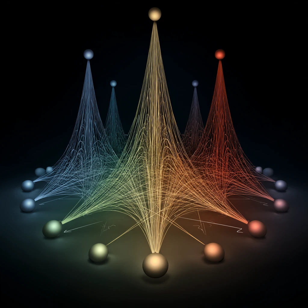
When biology differs, with missing cones, shifted peaks or differences in neural processing, colour experience differs too. About 8% of males and 0.5% of females of Northern European descent have red-green colourblindness. For everyone with normal trichromacy, we're all running the same algorithm on the same hardware.
The warm spectrum feels richer because it's wired that way. Your eyes sample that range more densely too, more cones and distinct wiring. The leading explanations for why primates evolved separate L and M cones are spotting ripe fruit and young leaves against mature foliage, and reading changes in skin tone. I do wonder tho, why the lack of infrared vision...

Blue? Cyan is... atmospheric. Contextual. The sky, the deep ocean, distant mountains. Important, but not worth the neural real estate I suspect.
Oh well, onto making some fancy glasses!